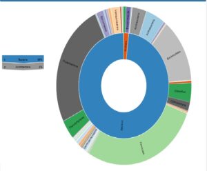
Hey y’all! I wanted to share of the first graphs I made using the CLC sequencing program. I had to play with the program for a bit to get this graph but I did it! This graph shows that bacteria made up 99% of the sample, while an unknown made up the rest. The program also allows the individual to go and select a portion of the chart and further analyze what microbes it consisted of. The different circles consist of the different samples I used in the analysis. The different colors represent the different bacteria, such as cynobacteria and chloroflexi.
October 19, 2020
Comments by cebarre4